I wanted to begin my rotospective series (where I go over one element from my first zine and discuss the thoughts and decisions that went into the second iteration of that element for my second zine, The Neon Jungle vol. 2) with the cover art. Since the cover is the thing that most people will see first when encountering one of my zines, and I want people to judge the zine by the quality of the cover, it was important to put a lot of intention into its creation.
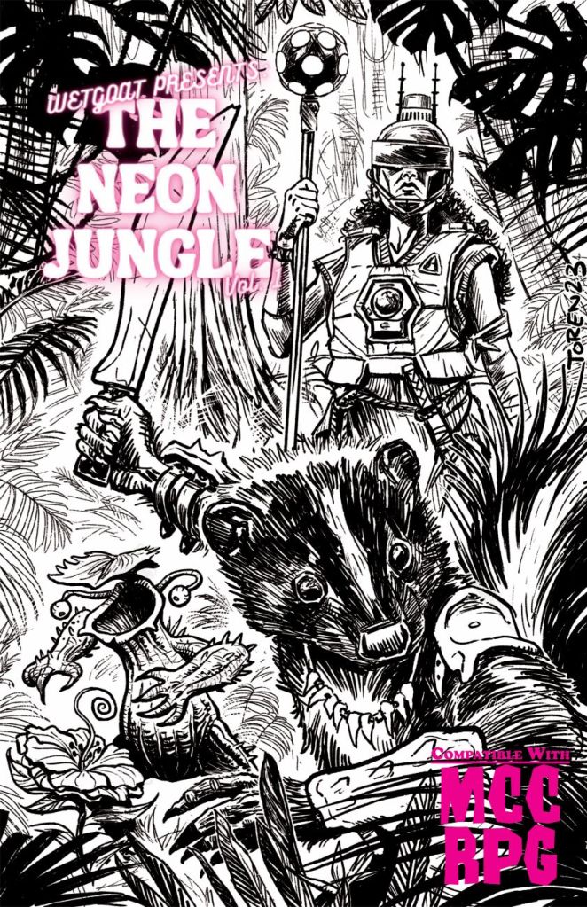
Back when I decided to make The Neon Jungle vol. 1, I knew the cover was quintessential to the zine’s success, and so, it was one of the earliest aspects I began to work on. I reached out to Toren Atkinson, who I met while I was working at Strategies Games & Hobbies. I had been aware of Toren’s work for some time, but after he played in a Mutant Crawl Classics game that I ran for Dungeon Crawl Classics Day, I had the courage to send him an email and set up my first commission for RPG art.
I probably emailed Toren about 10 days into the design process of the volume 1. All of my choices at this stage were instinct-based, I didn’t consider much else beyond what I wanted to see brought to life. I knew I wanted three characters exploring through the jungle, and I think that came from my fondness for the Dungeons & Dragons Player’s Handbook (PHB) 4e covers. These covers featured a couple adventurers that looked like they were ready for whatever the Dungeon Master was about to throw at them. I took this idea and tried to push it a bit further by making the jungle environment more prominent compared to the PHB cover environments because the zine included both player options and lots of options for the Judge to run the jungle as an immersive setting. Toren did a great job to having the lead character hacking through the brush of the jungle, that left me very happy with the balance between the characters and the environment.
Toren was also great at finding a way to execute my request of three characters on the cover, despite the dimensions of the zine being only half the size of a typical RPG book. Each of the three characters reference content within the zine, and sending the descriptions of each character was some of the most fun I had in the design process.
Right off the bat, I knew I wanted a skunk manimal leading the way. My neighbourhood in Vancouver is full of skunks at night, and I’ve become quite fond of the shy, yet visually striking creatures. To keep it simple, I requested the skunk with just a bone machete and a necklace full of sharp teeth.
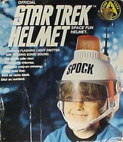
The second character was the Shaman of HALE-E, who I knew would have the busiest design, which is why I wanted the other characters to not be too busy. I wanted to include nostalgic references to the character’s gear that meant something to me, but also to Goodman Game’s wider audience, that I think I am on the younger end of. For myself, I included a laser tag vest and a staff made from one of those colourful disco lights that I saw in so many of my friend’s childhood rooms. The shaman’s helmet was a reference to an old Star Trek toy helmet that I believe never made an appearance in the show. I thought it would be a fun include, and it has ended up being the cover element that I have gotten the most comments on, so I’m pretty happy to have included it!
While I was confident with my choices for the first two characters, the plantient was decided upon based on what I still wanted and needed for the cover. I knew the third character would have to be smaller than the others so it could all fit on the cover. It made sense to include a plantient because there was a table for random Neon Jungle specific plantients, so I went through what I had decided and tried to imagine which ones would work as a smaller character. There were a few mushrooms that were a possibility, and that’s where my imagination was circling for a few days….
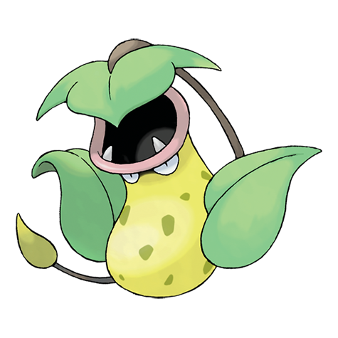
It was not until I was making level 0 characters for a funnel I was going to run that I settled on the pitcher plant for the character. As I came up with a slew of level 0s, one plantient captured my imagination more than the rest. I started thinking about the Pokemon, Victreebel, and thought that would be a good starting point. Toren was really able to bring the pitcher plant plantient to life, and I love how characterful it ended up being.
When I first saw the sketches, and eventually the final design, I was absolutely delighted. I attribute much of the zine’s success to the cover art, for which I am still so grateful for! As I looked towards vol. 2, I knew I wanted to maintain a similar style, but my considerations had evolved. For the second go around, I wanted to build upon and exceed the success of volume 1, so I started thinking about the best way to do that. Since, Mutant Crawl Classics is a niche roleplaying game that is not the familiar fantasy or the common post-apocalyptic barren wasteland, I needed a character that visually expressed what MCC is, or at least, what it is to me. MCC is a post-apocalyptic game that is an endless sandbox, and I think you could include any sort of fantasy or sci-fi elements that you wanted in your game, but at its most succinct, I like to think of it as stone age mutants discovering technology from the future. While I adore the lead skunk of volume 1, I’m not sure it expresses that stone age and retrofuturistic sci-fi matchup, so I went looking for inspiration in cultural touch points that I knew most people would be familiar with, enter: The Flintstones.
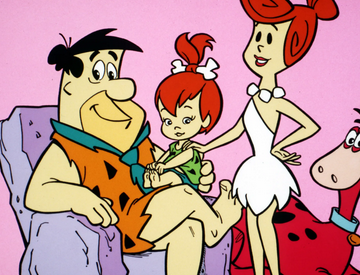
The Flintstones were the most ubiquitous stone age media that I could think of, so I started there. I always thought the bone in Pebbles hair was a great bit of character design, so is the specific detail that I started with. I went with an adult inspired by Pebbles, since I figured the hair-bone and stone necklace with a Flintstones style dress would communicate ‘stone age’ to the audience. The only thing I needed now was a sci-fi element that communicated MCC’s genre mashup. Since the character already had the stone age accessories, I did not want to overwhelm the character design with some busy sci-fi gadgets, I needed something sleek and instantly recognizable. This led me to one of the most iconic weapons from a galaxy far far away… a laser sword! Once I thought of the lightsaber, I was pretty much settled on it. I did consider other sci-fi weapons, like ray guns and rifles, but nothing seemed like it would be as visually striking as the lightsaber, so that’s what I included in the brief! I was super happy with Toren’s design for the character, she looks cool and confident, and I think the combination of recognizable design elements visually communicates the setting of Terra A.D. so that the audience can get a sense of what’s going on without ever having heard of Mutant Crawl Classics.
Once I had my stone age jedi sorted out, that left me with two more characters to decide on. Since the lead was a human, and volume 1 didn’t have any mutant characters on the cover, I knew I wanted the secondary character to be some sort of mutant. I had started working on a slug-based deity for the zine, and one of the earliest pieces of art I commissioned was for a character who had become more slug-like by my friend, Brayden Turrenne. Now technically, the slug characters are not mutants, but rather they are human healers that give themselves over to Smugu, the slug god, and begin to transform to be more slug-like. But visually, they fit into the mutant category, so I was happy moving forward with that sort of character even though they weren’t technically a mutant.
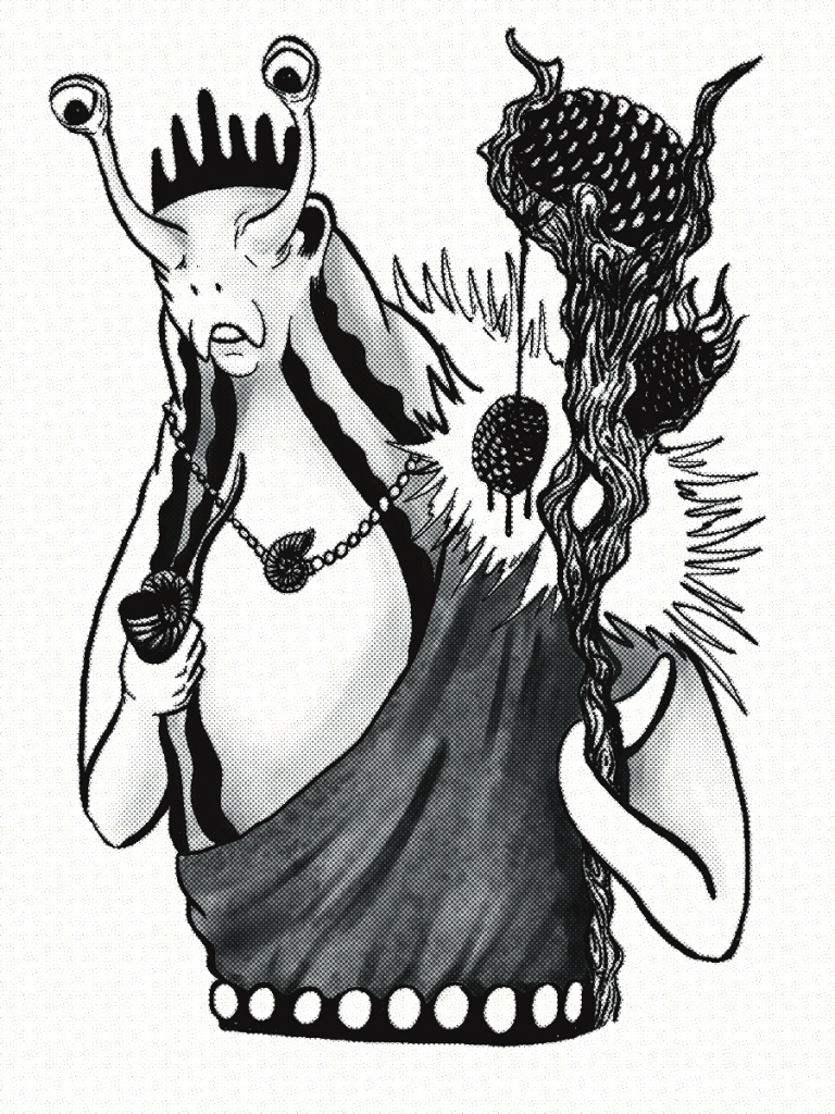
So I had the idea for my mutant, not technically a mutant, slug-man healer. Since the look of these slug healers was already established by Brayden’s piece, I just had to decide on some of the details. The gnarled wooden staff was an easy choice, I wanted to have something natural to balance out the technology, and I love the look of a gnarly staff in any game. The second accessory was the squirrel tail coat. The drop sucker, a three tailed vampire squirrel was the first creature I designed for the zine, and with my inclusion of weaving and tailoring in the zine, it made sense to have a character wearing an item made out of one of the jungle’s creatures. This ends up being a subtle detail, but I like how it looks and maybe some people will notice what it is as they go through the zine. Once again, Toren executed the character brief to perfection, and really brought the mutant-not-mutant slug healer to life!
This left me with one more character to sort out. I knew I wanted it to be a manimal, since I really enjoyed creating the skunk manimal in volume 1 and wanted to do another. I also knew that it needed to be small to fit on the cover with two regular adult-sized humanoids. I considered a lot of options, there’s no shortage of animals I’m fond of, but nothing was totally capturing my imagination. Even though the game’s label for mutant animal humanoids is manimal, there are examples of these characters that are not exclusively mammalian. This led me to consider insects, as it made sense to me for an insecticide manimal to be smaller than their beastly counterparts. I had a few ideas I toyed around with, but I eventually settled upon my favourite bug: the beetle! It was the only insect where the more I thought about it, the more ideas I had. I began to pull from different human cultures that revere beetles as well as fantasy tropes that are common to short-in-stature species. This eventually led the to Sunhorn Beetles, noble insects that have a proclivity for being honourable guardian warriors and ingenious tinkerers. All of this led to the Sunhorn Beetle on the cover holding a sci-fi rifle that was based upon a water gun from my childhood. Just like the other two characters, Toren really delivered and brought the insectoid animal to life!
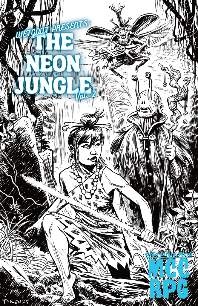
And after all of the consideration and Toren’s hard work, here is the cover for volume 2! I’m thrilled with how it looks, it definitely captures my interpretation of Terra A.D., the setting of Mutant Crawl Classics. Will what I am trying to visually communicate lead to more sales? Only time will tell on that front, but I think regardless of sales, this cover art is already a success in my book! If you’re interested in supporting The Neon Jungle vol. 2, check out the BackerKit!
